MS1 Exam Questions


Analyse the front covers;
GQ
- Masthead - GQ, stands out to readersCentral image - Clint Eastwood, appeals to an older audience?Discourse and cover lines - Suggests contents of magazine, as well as who its aimed atMode of address - Friendly? informal? DirectHouse style - Readers know what to expect - colour, font style, layout and design all conform to a regular pattern.2 main colours used - orange and white, stands outTagline - highly respected magazine? Boosts image of magazine and readerPrice - selling pointMen of the year issue - More reason for people to buy magazine, more people might be interestedCelebrity names - again makes the reader more inclined to buy and readObsession of the year - story, hints at sex and love life
Saga
Tagline - Claim of quality to audience, promise of pleasure
Masthead - plain, simple, clean
Central image - star image, may persuade people to buy the magazine - Again, hints at the target audience being an older audience
Discourse and coverlines - Again, hints at an older audience for the magazine
Real life story of Michael Caine - makes them feel involved, more likely to buy magazine
Mode of address - Friendly, direct
House style - 2 colours, red and white
Suggest two different audiences for GQ Magazine
Men - 21-35 - Highly respected magazine, may want to find out more about the man of the year etc
Men - 50+ - because of the cover star, and some of the discourse of the magazine.
How has the over 50 market been targeted for Saga Magazine?
Cover star used - Michael Caine, older man
Discourse - stories of childhood
Simplistic colour scheme
Discourse - Ageism and the BBC
Discourse - Cooking recipes etc
Discuss how media texts attract different audiences:
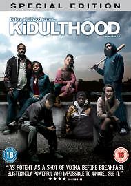
- Skins - teenage based, involves house parties, alcohol and drunk taking - Many young people will be able to identify with the characters within this program. Has multiple series, so is majorly successful. Can be applied to different media theories as to why audiences use this text.
- The Green Hornet - For fans of action films - car chases, bombs etc. However, people who are fans of Seth Rogen will also watch this film.
- Cosmo Magazine - For females aged 18-30 - Discourse of the magazine suggests this, articles about sex and love life. Also has articles on fashion, as well as including famous cover stars that many girls aspire to be like.
Different representations of age in the media
Young;
- August 2011 riots
- Olympics
- Tv shows, such as X Factor
- Attack the block
- Misfis/skins
- 16 and pregnant
- Old
- James bond
- Everybody loves Raymond - Marrie